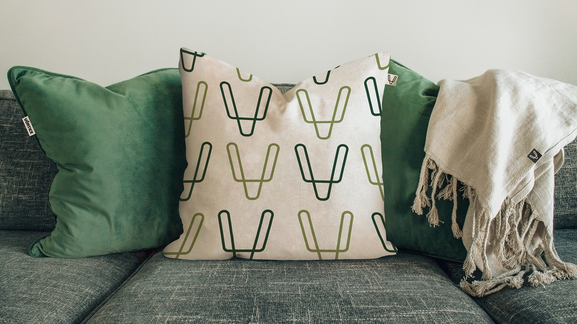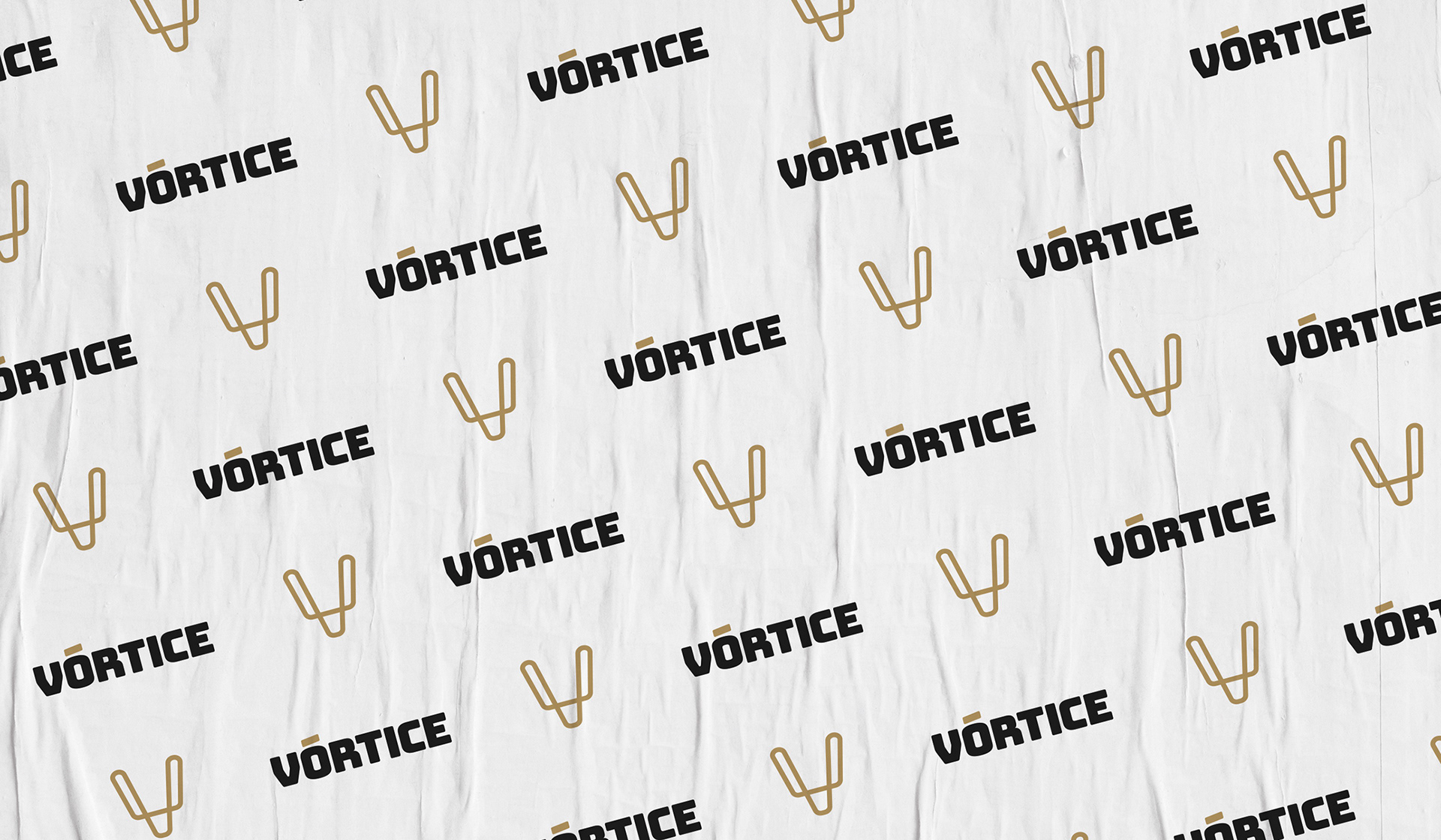
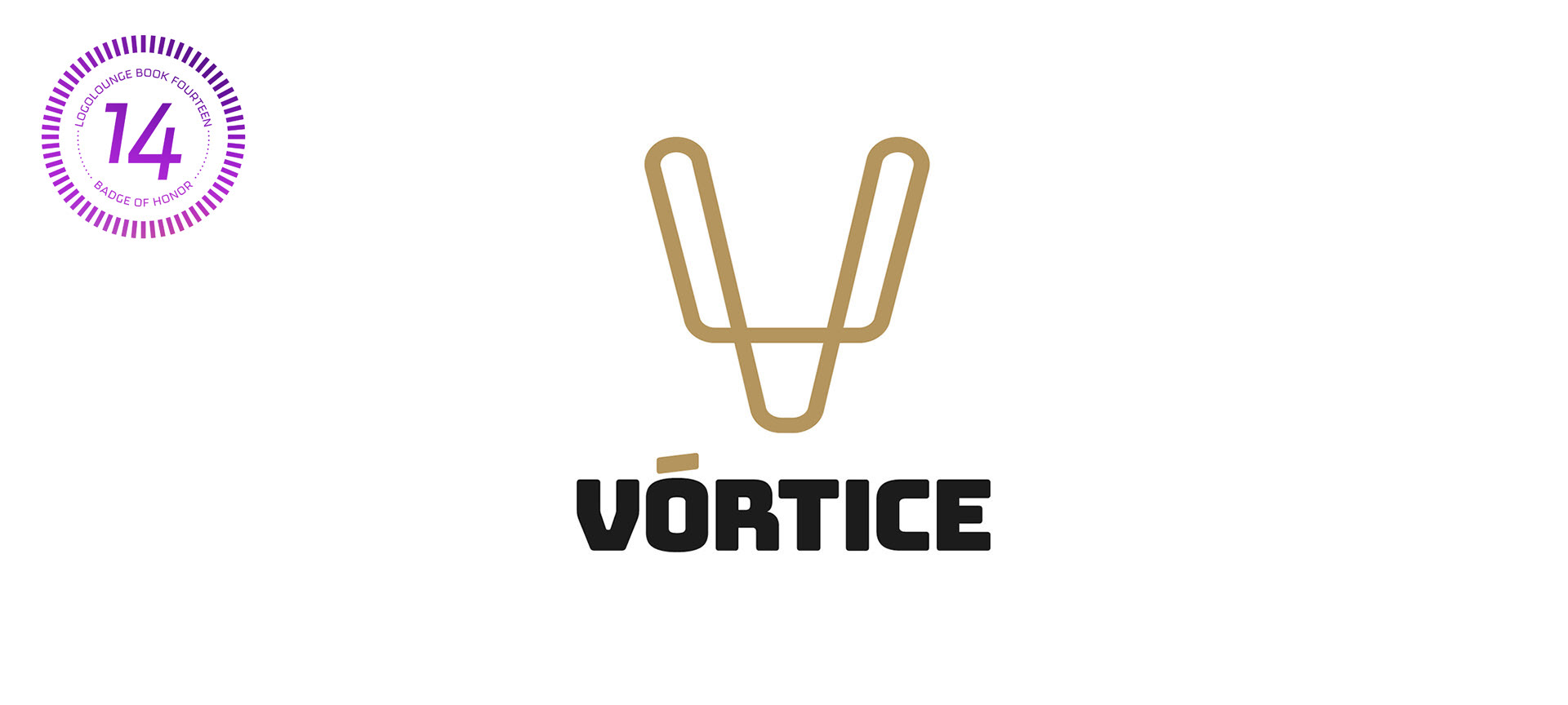
Marca para atelier de tecidos e almofadas.
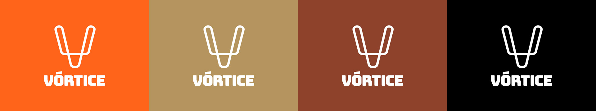
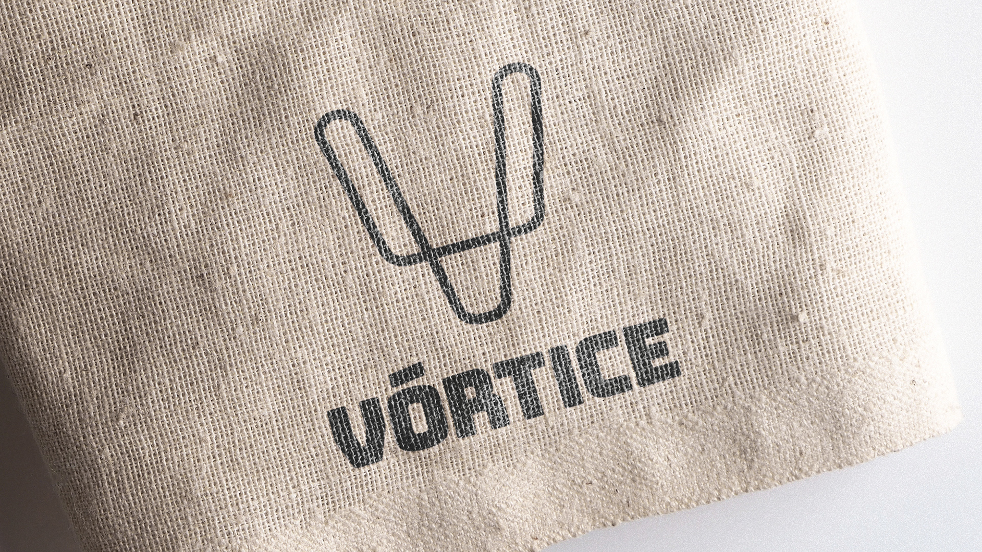
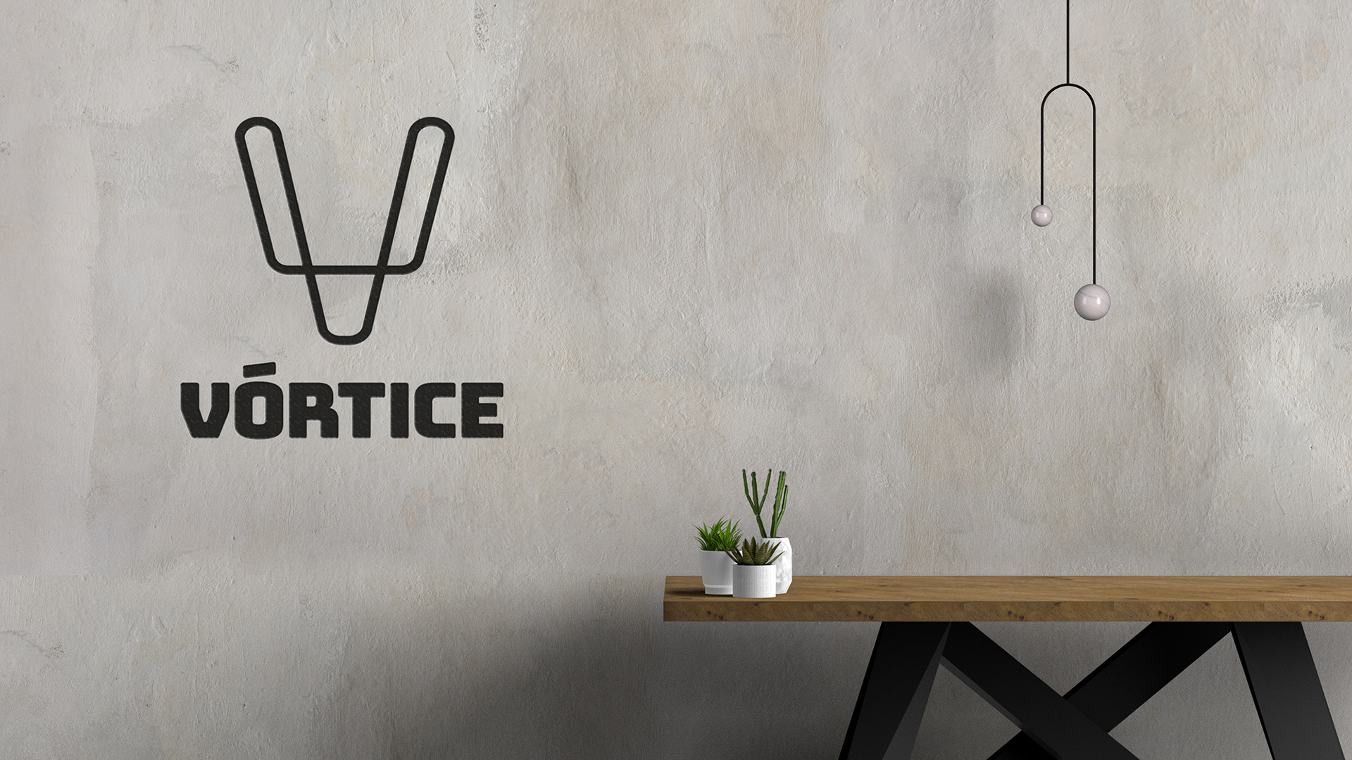
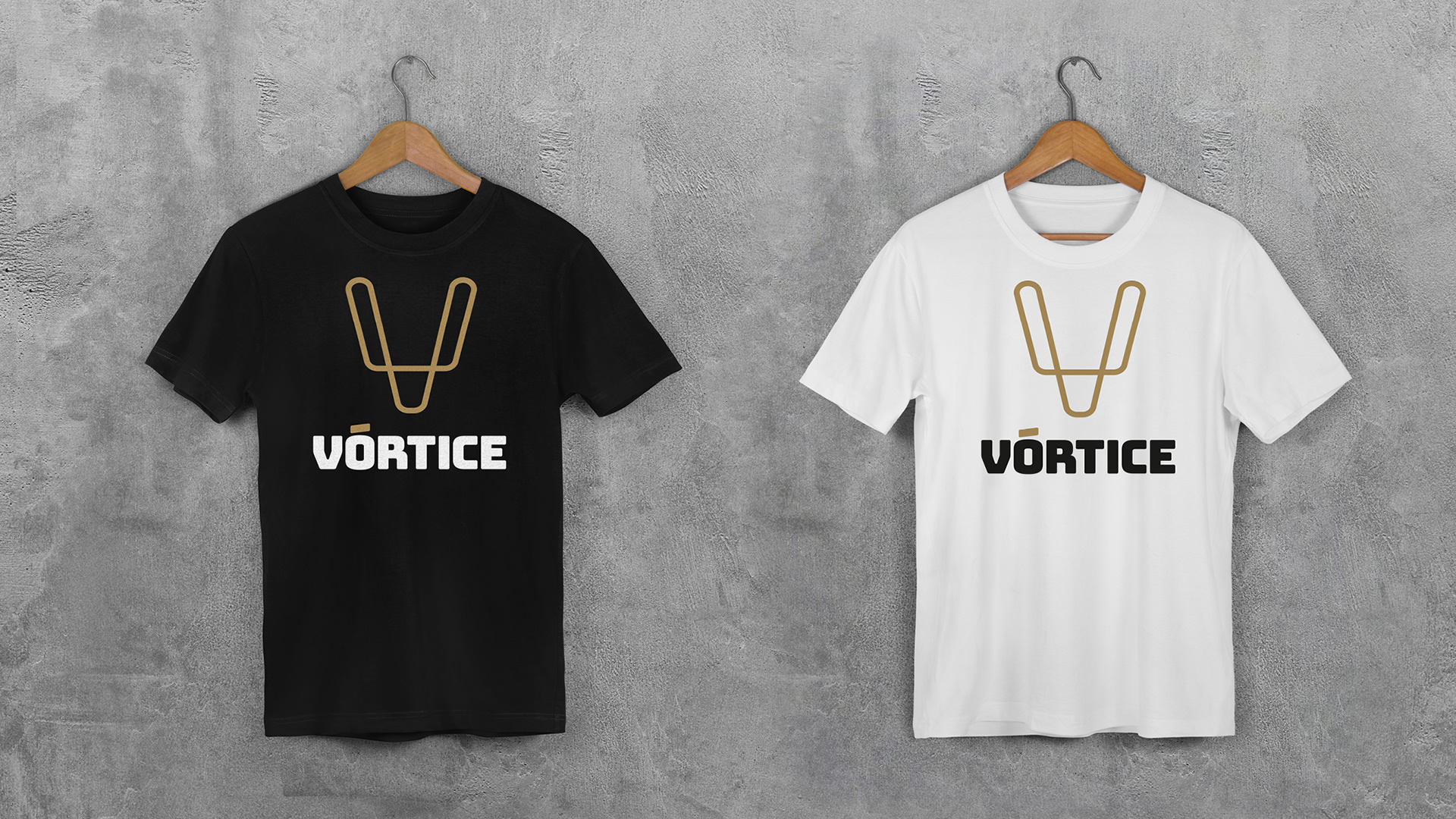
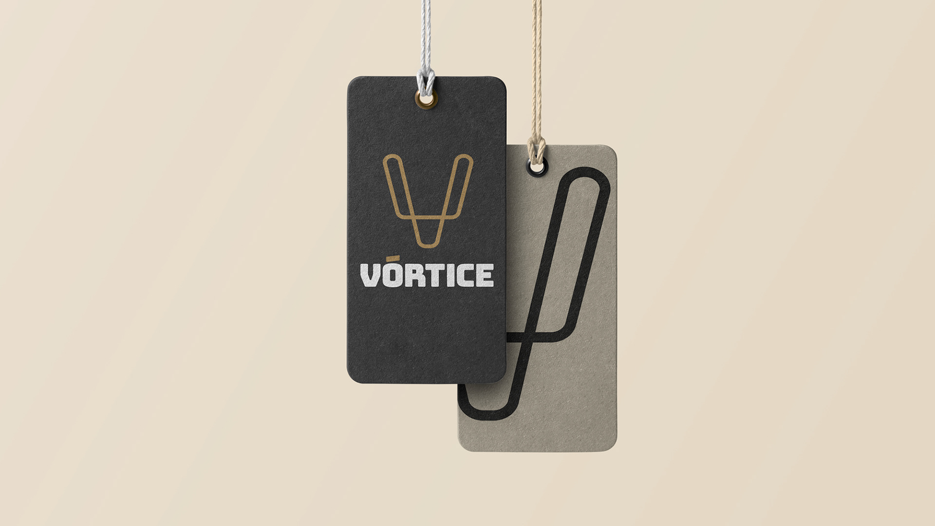
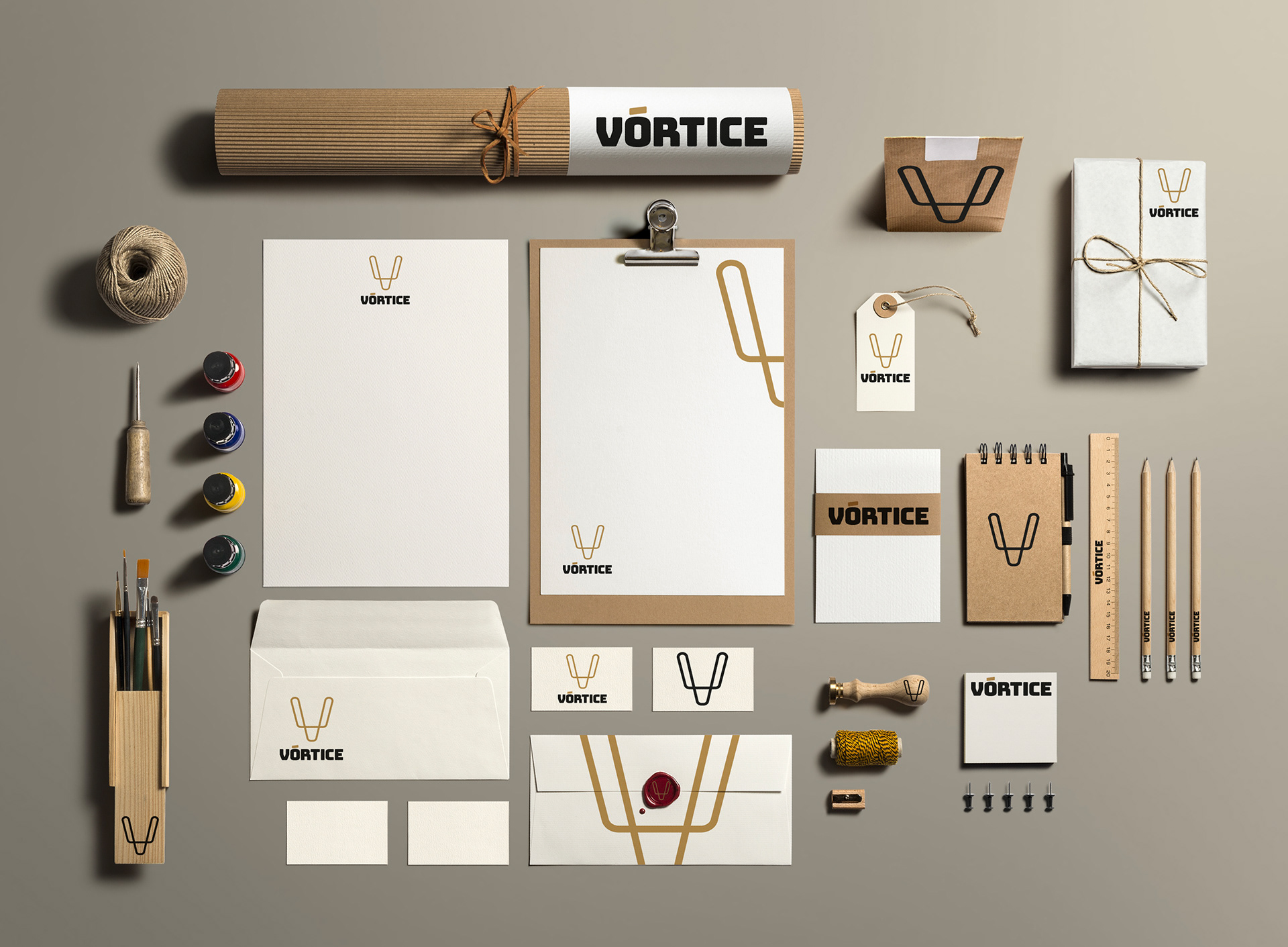
“V” de Vórtice. O desenho principal do ícone da marca evidencia esse elo entre a Vórtice e seus produtos, bem como suas infinitas possibilidades. O traço continuo, um novo caminho, retrata um novo momento em nossa vida, traduzindo a constante busca pela novidade. Como partida da criação, temos como base 3 elementos próximos que formam o nosso ícone: o elemento natural (Vórtice/Contínuo), o elemento animal (Samuel) e o elemento físico da marca (a inicial, a letra V). Um símbolo jovem, atual e contemporâneo.
Palavras-chave: simplicidade, conexão, relacionamento, rotação, fluidez, equilibrio, força.
--
Brand for fabric and pillow atelier.
“V” for Vortex. The main design of the brand's icon highlights this link between Vórtice and its products, as well as its infinite possibilities. The continuous line, a new path, portrays a new moment in our life, translating the constant search for novelty. As a starting point for the creation, we are based on 3 close elements that form our icon: the natural element (Vortex/Continuous), the animal element (Samuel) and the physical element of the brand (the initial, the letter V). A young, current and contemporary symbol.
Keywords: simplicity, connection, relationship, rotation, fluidity, balance, strength.